前言 参考案例:https://dragonir.github.io/3d/#/earthDigital
机甲风head和card 新建constant.js,存放一些固定的内容文本数组;
export const weekMap ={...};export const tips = [...];
设置state存放显示的内容;
const [week, setWeek] = useState (weekMap[new Date ().getDay ()]);const [time, setTime] = useState (new Date ().toLocaleTimeString ());const [showModal, setShowModal] = useState (false );const [modelText, setModelText] = useState (tips[0 ]);const [renderGlithPass, setRenderGlithPass] = useState (false );
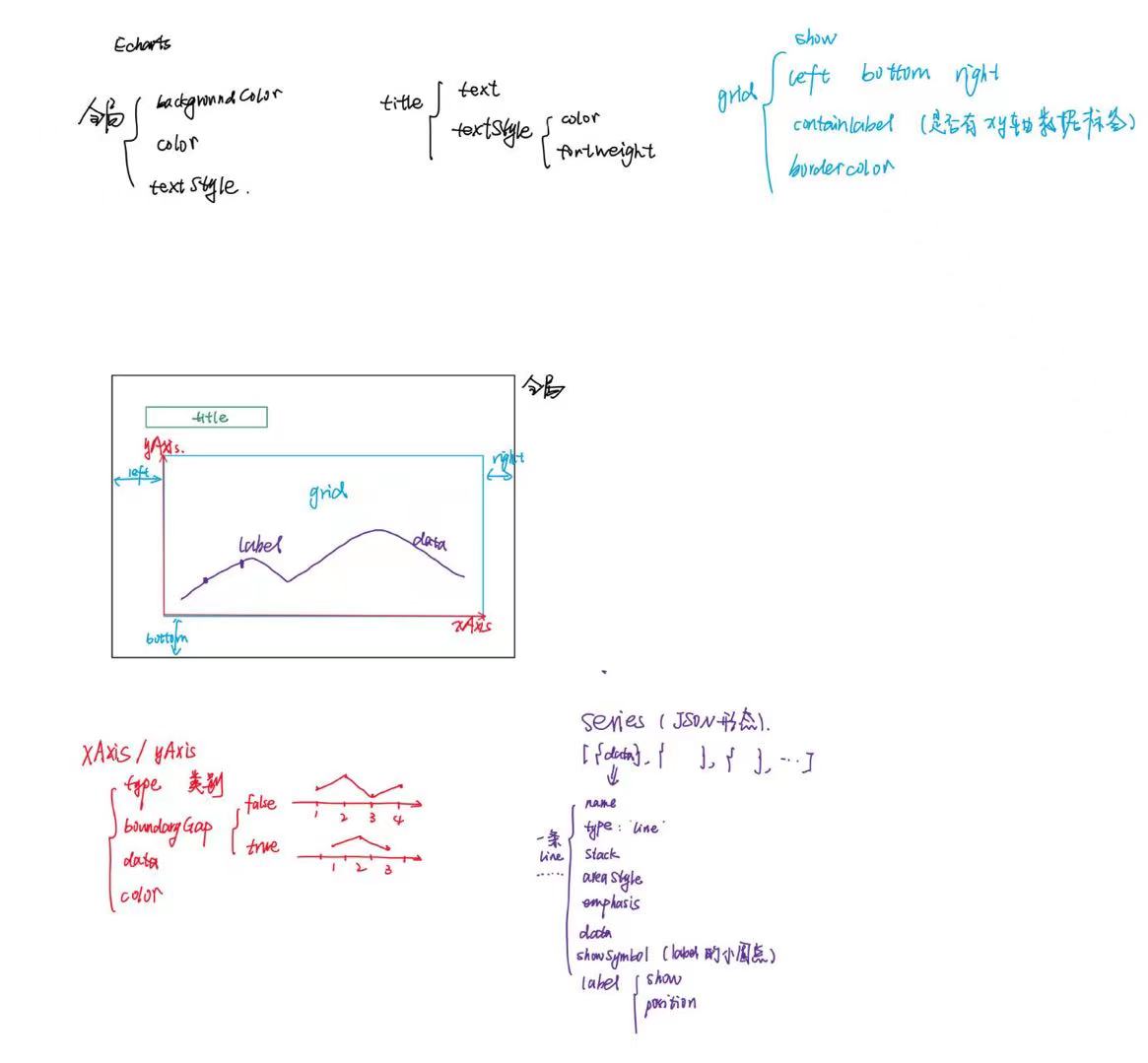
header结构
<header className ="hud-header" > <div className ="left" > </div > <div className ="middle" > </div > <div className ="right" > <p className ="date" > <span className ="text" > {`${week}曜日`}</span > <span className ="text" > {time}</span > <span className ="text" > Kepler-90 +49°18′18.58″</span > </p > </div > </header >
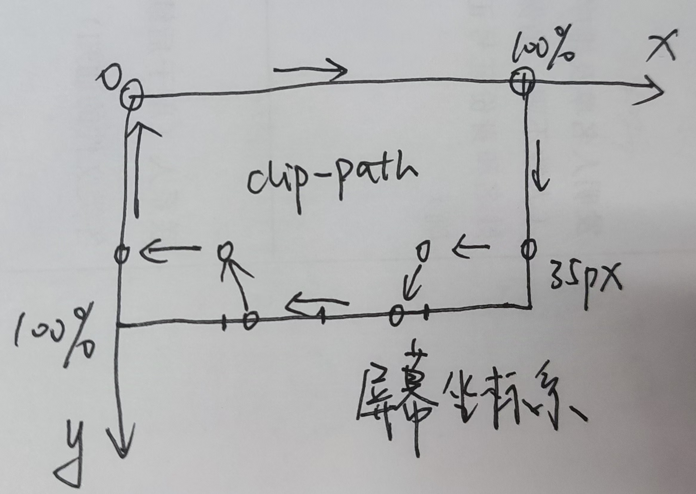
scss里写clip-path
$yellow-color : #f9f002 ; $border-color : #8ae66e ; $blue-color : #00e6f6 ; $header-height : 90px ; $aside-width : 400px ; $glitched-duration : 0.9s ; $clip-height : 18px ; .earth-digital { filter : saturate (0.85 ); } .hud { position : fixed; z-index : 2 ; &.header { height : $header-height ; color : black; background : $yellow-color ; clip-path : polygon (0 0 , 100% 0 , 100% calc (100% - #{$clip-height }),75% calc (100% - #{$clip-height}), 72.5% 100% , 27.5% 100% , 25% calc (100% - #{$clip-height}),0 calc (100% - #{$clip-height}),0 0 ); } }
logo和aside部分的结构
<div className="logo-pic" title='Cyberpunk 2077'></div>
<aside className="hud aside left">
  <div className="box inverse">
    <div className="cover"></div>
    <div className="info">
      <p><b>Cyberpunk</b> is a subgenre of science fiction in a dystopian futuristic setting that tends to focus on a "combination of lowlife and high tech", featuring futuristic technological and scientific achievements, such as artificial intelligence and cybernetics, juxtaposed with societal collapse or decay. </p>
      <button></button>
    </div>
  </div>
  <div className="box"></div>
  <div className="box inverse dotted"></div>
</aside>
<aside className="hud aside right">
  <div className="box"></div>
  <div className="box"></div>
  <div className="box inverse dotted"></div>
</aside>
点击触发函数:
const handleStartButtonClick = () => {
    setRenderGlithPass(!renderGlithPass);
  }
动画中更新:
const animate = () => {
 ......
  renderGlithPass && composer.render();
}
后处理效果 导入composer和pass
import { EffectComposer } from 'three/examples/jsm/postprocessing/EffectComposer.js' ;import { RenderPass } from 'three/examples/jsm/postprocessing/RenderPass.js' ;import { GlitchPass } from 'three/examples/jsm/postprocessing/GlitchPass.js' ;
initThree里初始化
composer = new EffectComposer (renderer); composer.addPass (new RenderPass (scene, camera)); composer.addPass (new GlitchPass ());
btn的样式 利用linear-gradient,实现了45度方向上,从透明到红色的按钮的突变(5%,5%),这个和《CSS揭秘》里的内容呼应了。
.startBtn ,.startBtn ::after { cursor : pointer; width : 120px ; height : 40px ; font-size : 1.2rem ; background : linear-gradient (45deg , transparent 5% , #FF013C 5% ); border : 0 ; color : #fff ; letter-spacing : 0.2em ; box-shadow : 6px 0 0 $blue-color; outline : transparent; position : relative; }
echarts https://echarts.apache.org/handbook/zh/basics/import/
按需引入:
import * as echarts from 'echarts/core' ;import { BarChart } from 'echarts/charts' ;import { TitleComponent , TooltipComponent , GridComponent , DatasetComponent , TransformComponent } from 'echarts/components' ; import { LabelLayout , UniversalTransition } from 'echarts/features' ;import { CanvasRenderer } from 'echarts/renderers' ;echarts.use ([ TitleComponent , TooltipComponent , GridComponent , DatasetComponent , TransformComponent , BarChart , LabelLayout , UniversalTransition , CanvasRenderer ]);
构建数据 constant.js
导入:import { chart_1_option, chart_2_option, chart_3_option, chart_4_option, chart_5_option, weekMap, tips } from '@/containers/EarthDigital/scripts/config';
初始化chart
const chart_1 = echarts.init(document.getElementsByClassName('chart_1')[0], 'dark');
   chart_1 && chart_1.setOption(chart_1_option);
使用useRef进行简化
let chartsRef = Array.from({ length: 5 }).map(() => useRef(null));
const initChart = () => {
  const chartsOption = [chart_1_option, chart_2_option, chart_3_option, chart_4_option, chart_5_option];
  const charts = chartsRef.map(ref => ref.current && echarts.init(ref.current, 'dark'));
  charts.forEach((chart, idx) => {
    chart && chart.setOption(chartsOption[idx]);
  });
}
最后的aside
<aside className="hud aside left">
  <div className="box box_0 inverse">
    <div className="cover"></div>
    <div className="info">
      <p className='text'><b>Cyberpunk</b> is a subgenre of science fiction in a dystopian futuristic setting that tends to focus on a "combination of lowlife and high tech", featuring futuristic technological and scientific achievements, such as artificial intelligence and cybernetics, juxtaposed with societal collapse or decay. </p>
      <button className="startBtn" onClick={handleStartButtonClick}>START</button>
    </div>
  </div>
  <div className="box"><div className="chart" ref={chartsRef[0]}></div></div>
  <div className="box inverse dotted"><div className="chart" ref={chartsRef[1]}></div></div>
</aside>
<aside className="hud aside right">
  <div className="box"><div className="chart" ref={chartsRef[2]}></div></div>
  <div className="box"><div className="chart" ref={chartsRef[3]}></div></div>
  <div className="box inverse dotted"><div className="chart" ref={chartsRef[4]}></div></div>
</aside>
echarts里的option配置
注意:每一种图表形式的使用,都要按需导入;
针对areaStyle里的颜色,可以不导入echarts,直接colorStops来实现;
areaStyle : { opacity : 0.8 , color : new echarts.graphic .LinearGradient (0 , 0 , 0 , 1 , [{ offset : 0 , color : 'rgb(128, 255, 165)' }, { offset : 1 , color : 'rgb(1, 191, 236)' } ]) }, areaStyle : { opacity : 0.8 , color : { type : 'linear' , x : 0 , y : 0 , x2 : 0 , y2 : 1 , colorStops : [ { offset : 0 , color : 'rgb(255, 191, 0)' }, { offset : 1 , color : 'rgb(224, 62, 76)' }, ], }, },
css动画 .。。。。。待更新。。。。。。。
补充 | clip-path属性 CSS 中的 clip-path 属性允许你定义一个元素的可见区域。通过这个属性,你可以指定一个路径,在这个路径内的内容会被显示,而路径外的内容则会被隐藏。这是一个非常强大的工具,因为它可以用来创建各种复杂的形状和动态效果。
创建复杂形状 :使用 clip-path,你可以轻松创建圆形、椭圆、多边形或者自定义路径(使用 SVG 路径语法)等形状。这对于设计先进的用户界面和特殊的图形效果非常有用。
交互效果 :你可以结合动画和过渡效果使用 clip-path,以实现视觉上吸引人的交互动画。例如,当用户悬停或点击元素时改变 clip-path 的形状。
掩盖和显示内容 :它可以被用来掩盖元素的某部分或只显示某部分,这在创建仪表板、卡片或其他包含隐藏详细信息的界面元素时尤其有用。
基本语法 :shape 可以是以下几种类型:
圆形 (circle()):
这会创建一个圆形剪裁区域,其中 50% 是圆的半径。
椭圆 (ellipse()):
clip-path : ellipse (50% 25% );
这将创建一个椭圆剪裁区域,其中第一个值是水平半径,第二个值是垂直半径。
多边形 (polygon()):
clip-path : polygon (50% 0% , 100% 50% , 50% 100% , 0% 50% );
这将创建一个菱形剪裁区域,每个百分比对是多边形一个顶点的坐标。
使用 URL (SVG 剪裁路径):
clip-path : url (#clip-shape );
这里 #clip-shape 是 SVG 内的 <clipPath> 元素的 ID,允许你使用 SVG 的复杂路径定义剪裁形状。
通过使用 clip-path,开发者可以在不需要额外图像或 SVG 文件的情况下,直接在 CSS 中创建视觉上吸引人的形状和效果。这使得页面加载更快,也使得动态效果的实现更为简便。
 微信
微信 支付宝
支付宝